Wow! Microsoft’s Business Application Summit just got over and I can’t believe all of the great things that were announced. check out the following links for details on the summit.
Here is a list of some of the features that are coming:
- Integration with Python – Connector and custom visuals like R
- Composite model – Composite models allow you to mix import and tabular direct query sources.
- Aggregations – Massive volumes of data require new ways of storing information to balance the needs of slice-and-dice interactive analysis with deep, detail-level reporting.
- Intellisense support for the M formula language
- Smart Data Prep – Data profiling and fuzzy-logic matching
Find out more about these feature and more by viewing the On Demand sessions from the Business Applications summit – https://www.microsoft.com/en-us/businessapplicationssummit[](https://www.microsoft.com/en-us/businessapplicationssummit)
October 2018 Release Overview – https://docs.microsoft.com/en-us/business-applications-release-notes/October18/[](https://docs.microsoft.com/en-us/business-applications-release-notes/October18/)
Now on to part two of my Create Awesome Business Central Data Analysis. In my last post, How to Create Awesome Business Central Data Analysis, one of the things I discussed was how to connect Power BI to Dynamics 365 Business Central and build an Inventory Performance report.
Creating our Sales Performance Visual
Here are the data tables we are going to import to analyze our Business Central sales data:
- SalesDashboard
- Customers
- Customer List
After importing the SalesDashboard data we need to make the following changes.
- Rename several columns
- Remove several columns listed below in the M Code.
- Add a custom column to calculate Profit
Here is the M code to help you with the transformations. You will need to change the source information to match your environment.
    Source = Dynamics365BusinessCentral.Contents(null),
    #"CRONUS USA, Inc." = Source{[Name="CRONUS USA, Inc."]}[Data],
    SalesDashboard_table = #"CRONUS USA, Inc."{[Name="SalesDashboard",Signature="table"]}[Data],
    #"Renamed Columns" = Table.RenameColumns(SalesDashboard_table,{{"AuxiliaryIndex1", "Country"}, {"AuxiliaryIndex3", "Item No"}}),
    #"Removed Columns" = Table.RemoveColumns(#"Renamed Columns",{"ETag"}),
    #"Renamed Columns1" = Table.RenameColumns(#"Removed Columns",{{"SalesPersonName", "SalesPerson Name"}}),
    #"Removed Columns1" = Table.RemoveColumns(#"Renamed Columns1",{"Sales_Amount_Expected", "Cost_Amount_Expected", "Customer_Disc_Group", "Country"}),
    #"Added Custom" = Table.AddColumn(#"Removed Columns1", "Profit", each [Sales_Amount_Actual]+[Cost_Amount_Actual]),
    #"Calculated Absolute Value" = Table.TransformColumns(#"Added Custom",{{"Quantity", Number.Abs, type number}, {"Cost_Amount_Actual", Number.Abs, type number}}),
    #"Renamed Columns2" = Table.RenameColumns(#"Calculated Absolute Value",{{"AuxiliaryIndex2", "Customer No"}})
in
    #"Renamed Columns2"
Now with all three Business Central view imported, we can Save & Apply our changes.
Creating the DAX for our Sales Performance Report
On the Sales Performance report, I’ve added the ability to segment my Accounts Receivable into aging buckets. Here are the steps I used to add the changes to the report.
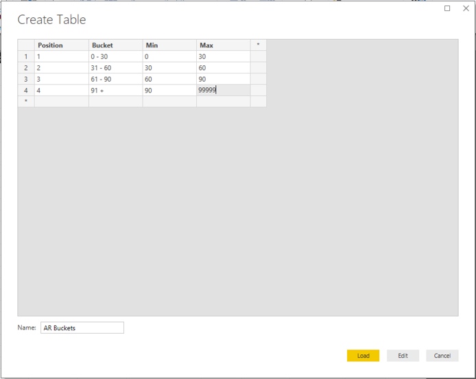
- First, I clicked on the “Enter Data” icon from the Home tab in Power BI Desktop and entered the following information and named the table “AR Buckets”.

- The DAX Columns & Measures needed for our visuals:
First our new two columns:
InvoiceAge =
 ( TODAY () )
    - IF (
        ISBLANK ( 'Customer List'[Posting_Date] ),
        TODAY (),
        'Customer List'[Posting_Date]
    )
ARBucket =
CALCULATE(
    VALUES('AR Buckets'[Bucket]),
    FILTER(
        'AR Buckets',
        'Customer List'[InvoiceAge] >='AR Buckets'[Min]
        && 'Customer List'[InvoiceAge] < 'AR Buckets'[Max]
    )
)
Then our DAX measure:
Aged_AR =
IF (
    COUNTROWS ( 'AR Buckets' ) = 1,
    CALCULATE (
        [AR_Balance],
        FILTER (
            'Date',
            MAXX ( 'Date', MAX ( 'Date'[Calendar EndOfMonth] ) - EARLIER ( 'Date'[Date] ) )
                >= MAX ( 'AR Buckets'[Min] )
                && MAXX ( 'Date', MAX ( 'Date'[Calendar EndOfMonth] ) - EARLIER ( 'Date'[Date] ) )
                    < MAX ( 'AR Buckets'[Max] )
        )
    ),
    [AR_Balance]
)
With the Columns and Measure created for the Aged Account Receivable visual, let’s work on our Gross Sales, Revenue Total, Revenue Percent, Cost Total and Cost Percent DAX Measures.
Gross Sales CY = SUM('Sales'[Sales_Amount_Actual])
Gross Sales LY = CALCULATE(
    [Gross Sales CY] ,
        SAMEPERIODLASTYEAR( 'Date'[Date] ))
RevenueTotal =
CALCULATE ( SUM ( 'Sales'[Sales_Amount_Actual] ), ALL ( 'Sales' ) )
RevenuePct =
    SUM('Sales'[Sales_Amount_Actual])/[RevenueTotal]
SalesCostTotal =
    CALCULATE(SUM('Sales'[Cost_Amount_Actual]),ALL('Sales'))
SalesCostPct =
    SUM('Sales'[Cost_Amount_Actual])/[SalesCostTotal]
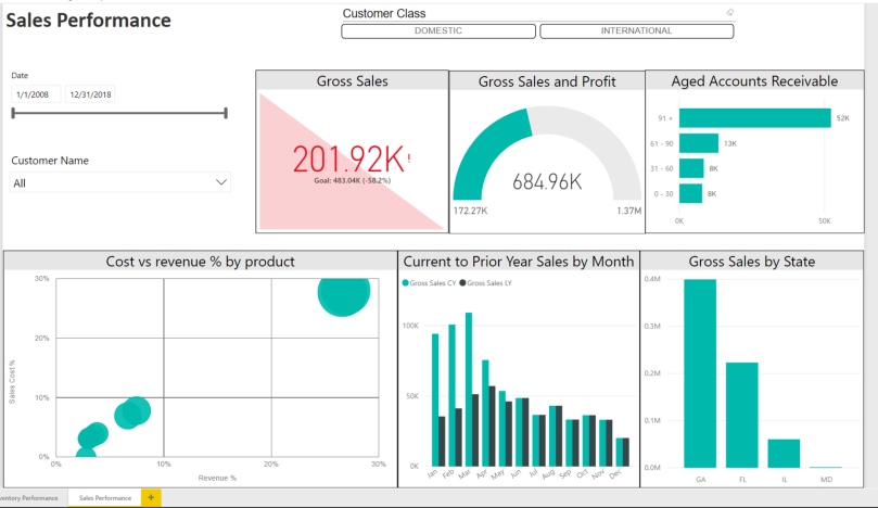
With all of the DAX Columns and Measures created we can now put them all together to create the below Sales Performance report that now gives us the ability to track KPI to goals, see Sales, Profit and Cost trends over time. Here is how we create our visuals:
- Gross Sales KPI – add the Gross Sales CY measure to the Indicator field in the Visualization pane, Calendar Year from Date dimension to Trend axis and Gross Sales LY measure to Target goals.
- Gross Sales and Profit Gauge – Add Gross Sales to the Value field of the Visualization pane and Profit to the Minimum value field.
- Aged Accounts Receivable clustered bar chart – Add ARBucket column from Customer List to the Axis field in the Visualization pane and Aged_AR measure to the Value field.
- Cost vs Revenue % by Product EnhancedShatter chart – Add Item Description to the Details field in the visualization pane, RevenuePct measure to the X Axis field, SalesCostPct to the Y Axis field, Sales_Amount_Actual field to the Size field and Profit to the Color saturation field.
- Current to Prior Year Sales by Month clustered column chart – Add Calendar Month from the Date dimension to the Axis field in the visualization pane, Gross Sales CY and Gross Sales LY measures to the Value field.
- Gross Sales by State line and clustered column chart – Add State from the Customers dimension to the Shared Axis field in the visualization pane and Gross Sales to the Columns Value field.

Start your Power BI learning for free and bring your company data to life!
Power BI transforms your company’s data into rich visuals for you to collect and organize so you can focus on what matters to you. Stay in the know, spot trends as they happen, and push your business further.
Looking for new ways to find and visualize data and to share your discoveries? Power BI can help. This collection of tools, online services and features from Microsoft transforms your company’s data into rich visuals for you to collect and organize, so you can spot trends, collaborate in new ways, and make sense of your data. Start your Power BI learning at some of these great sites:
- https://docs.microsoft.com/en-us/power-bi/guided-learning/.
- Chris Webb’s BI Blog.
- Guy in a Cube.
- http://radacad.com/category/power-bi.
- https://www.sqlbi.com/ .
- http://dataveld.com/tag/power-bi/.
- https://enterprisedna.co/.
Happy learning and visualizing your data!