Part 4 of a 5 part series
The adage “A picture is worth a thousand words” refers to the notion that a complex idea can be conveyed with just a single still image. It also appropriately characterizes one of the main goals of data visualization, namely making it possible to absorb large amounts of data quickly.
The point of Power View is to make it very easy to create pretty, interactive data presentations or reports that will make your boss go “Wow, how did you do that? You’re a genius!” Well, OK, maybe not that far but you’ll definitely look smart. Plus, it also can be used to explore your data visually without worrying about messing anything up and even make reports on your own, without IT help.
Power View provides visualization of Power Pivot Data Models and SSAS tabular mode databases. Power View doesn’t work directly on top of relational data or local Excel data, but Excel 2013 can create a data model on the fly when needed.
Microsoft is continually updating Their Power BI suite and released updates to their Power Map feature that includes filtering and custom maps.
To see Power View in action I will be using my Patron data model from Part three of this five part series, follow these steps:
Insert a Power View sheet
1. Click on the “Insert” tab
2. In the middle of the ribbon, click on the “Power View” button in the Reports section (to the right of the Charts section)
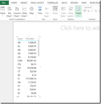
3. Next drag the State and TheoWin from the right onto the Power View canvas on the left.
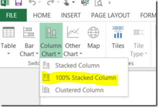
4. Next click on Column Chart and then 100% Stacked Column
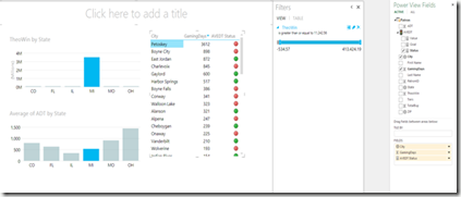
5. Continue this process by drag from the right to the Power View canvas on the left any additional visualizations that you want for your report. The results of my report are below.
Creating Power View Map Reports in Excel 2013
Now let’s create some cool Power View map reports. For this demonstration, I will continue to use the Patron model from my previous blog post as you can see below:
1. Simply drag Sales Amount and Country from the Power View Fieldslist and your report should look like as shown below:
2. To turn the above tabular report to a map report, simply go to Designtab and then click on Map icon as shown below:
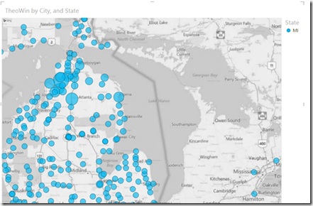
3. That’s all and here is your first map report for the TheoWin (Casino Sales). Hovering on any of the circles will provide the detail information; also the size of the circle indicates the value with respect to the other values for the report.
4. To make additional changes to your Power Map click on the insert tab and then Map.
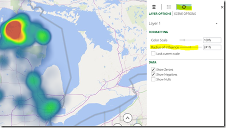
5. In my example I will use the Radius of Influence to show a heat map of where our casino revenue (Theo Win) is coming from. Click on setting and then Change Radius of Influence.
Next Steps
Creating basic Power View and Power Map dashboards/reports are fairly easy and usually don’t require any IT resources except to provide a data model and possibly security access to the database for importing data. To find out more about Power BI click here to visit Microsoft’s Office site. In my final post in this series we will put it all together by creating a Office 365 Power BI site and sharing our Excel Analysis work book.

